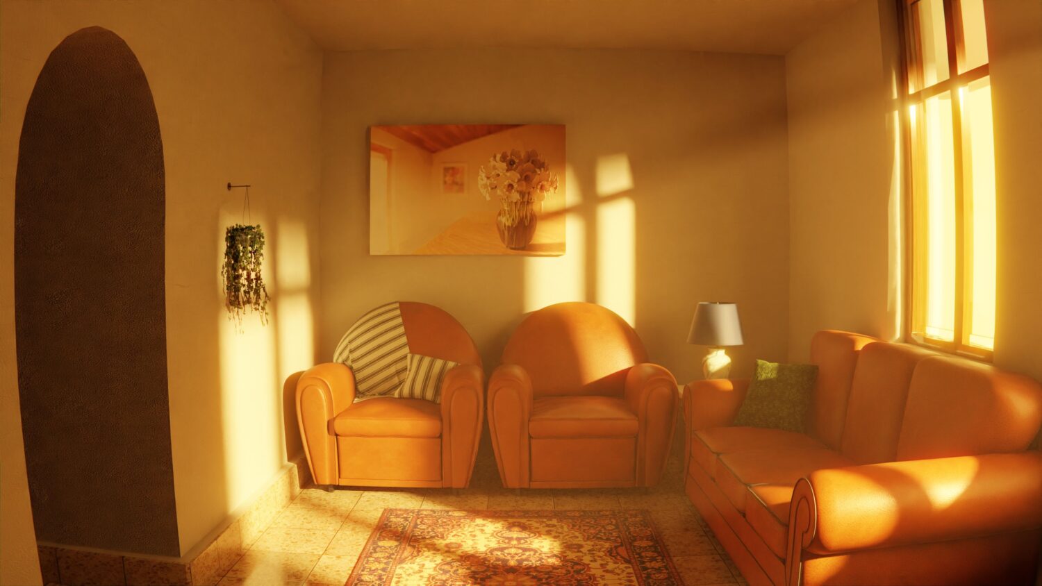
Ever walked into a room in late October and felt… cold?
Not temperature cold. Design cold.
That’s what ten years of cool grey did to houses. Ice block walls, bright white doors, chrome hardware. It photographed well. It also sort of felt like waiting rooms.
Autumn and winter reveal that. Light falls away, days shorten and crisp cool colours become flat and unwelcoming.
The good news?
Warm neutrals are trending again. Oat, clay, mushroom, putty, caramel, toasted almond — you name it.
Here is what is happening, and how to bring it home…
Inside this guide:
- Where The Warm Neutral Shift Starts
- What Counts As A Warm Neutral (And What Doesn’t)
- Why The Grey Era Finally Ended
- How To Soften A Room Before The Clocks Change
Where The Warm Neutral Shift Starts
It starts in the kitchen. Almost always.
Kitchens impact the temperature of an entire home. They have the largest amount of surface area due to cabinetry. Swap the doors and you’ll instantly change the mood of the space.
Plus, the data proves it. The 2026 Houzz Kitchen Trends Study put wood cabinets at 29%, over white cabinets at 28%. That’s right, wood beat out white for the first time in years.
That is huge news. White had been number one for almost ten years.
It’s also why so many homeowners shopping for wholesale cabinets this fall breeze right by the bright white shaker doors. Stained oak, walnut tones and creamy off-whites are what homeowners tend to gravitate towards. Compare kitchen cabinets in Phoenix and you’ll see the same trend play out on the showroom floor. Plus, warm-toned wholesale cabinets don’t usually cost more than cooler versions — making them the most affordable temperature shift you can make in your home.
Medium wood tones lead at 15%, with lighter woods close behind at 11%.
Warm. Grounded. Easy to live with in December.
But colour isn’t the only change. Door profiles have also evolved to become softer and more gentle. Slimmer shaker styles, flat slab doors and eased edges are replacing those chunky raised panels and deep routed grooves that overwhelmed older kitchens. Simple, understated profiles allow the wood grain to shine through – because that is the whole point.
What Counts As A Warm Neutral (And What Doesn’t)
A warm neutral is any desaturated color that has an underlying yellow, red or brown undertone.
The easiest test is this: hold the colour next to a sheet of printer paper. If it appears creamy, muddy or slightly pink it is warm. If it looks blue, green or faintly purple it is cool.
The warm neutrals worth knowing this season:
- Oat and oatmeal — soft, milky and endlessly forgiving
- Putty and mushroom — grey’s friendlier cousin
- Clay and terracotta — earthy without shouting
- Caramel and camel — rich enough to anchor a room
- Chocolate and espresso — the deep end of the palette
Notice anything missing? Greige. That chilly, dusty neutral is the first victim of the entire shift.
Why The Grey Era Finally Ended
Cool greys were never selected for comfort. They were picked because they were safe, they SOLD HOUSES, and they looked cool under flash.
But nobody actually lives inside a photograph.
Designers saw it coming. In the latest annual designer trends survey, designers named chocolate brown the top colour of 2026. That share has grown by almost double since 2022 when it ranked at 17%.
Warm is no longer the risky choice. Cool is.
It also makes sense practically speaking. Winter light is less intense and comes from a lower angle. What looked like a crisp cool grey wall in June looks dull and kind of dirty in November. Warm neutrals do the opposite—they reflect what little light they receive and send it back softer.
Same room. Completely different feeling.
Texture Is Doing Half The Work
Colour gets the attention. Texture does the heavy lifting.
OK, a flat cream wall is fine. Cream wall with movement in limewash, a boucle chair, chunky wool throw and oak cabinet fronts is a room no-one wants to leave.
Consider: warm neutrals are subdued colours. Remove the texture and subdued becomes mundane in the blink of an eye.
Good layers to reach for:
- Matte and satin finishes instead of high gloss
- Natural stone with visible veining and movement
- Wool, linen, boucle and brushed cotton
- Visible wood grain rather than flat painted surfaces
- Aged brass and bronze in place of polished chrome
The goal is depth, not decoration.
How To Soften A Room Before The Clocks Change
Your home doesn’t have to be redecorated all at once this season. The good news — tiny tweaks yield the most heat.
Start With The Biggest Surface
Ceilings, cabinetry or flooring. Whatever finishes over the largest area, that’s where your budget should go. Painting your hallway a warm off-white can accomplish more than twenty box of new pillows.
Mix Finishes, Don’t Match Them
Painted to match each door and handle are surfaces that read flat. About one-quarter of kitchen-renovating homeowners today use two cabinet colours in one kitchen, typically a lighter warm tone above and a darker wood or earthy tone below.
That is contrast without chaos.
Swap The Lighting Temperature
This bulb is practically free. Swap cool white bulbs for warm ones (~2700K). Cool bulb makes warm neutral wall look grey and ill. Warm bulb makes it glow.
Bring In One Natural Material
Wood, stone, clay, rattan or jute. One of these, somewhere apparent. Natural materials bring warmth into a space like nothing synthetic can.
Mistakes That Flatten A Warm Palette
Two things go wrong most often.
One mistake is accidentally pairing warm and cool undertones. A creamy cabinet next to blue-grey countertop will make both shades appear off, and most folks wont know why.
The second mistake is being too matchy. Five different shades of beige in one room does not make a warm neutral palette. It makes a sandcastle.
Vary the depth. Keep the undertone consistent.
Bringing The Warmth Home
Warm neutrals didn’t just come out of nowhere and become a trend. It’s a correction — moving away from rooms that looked good but felt cold.
Fall and winter are ideal times to make the switch because those are the seasons when a chilly room becomes noticeable.
A quick recap:
- Start with the biggest surface in the room
- Choose undertones that lean yellow, red or brown
- Layer in texture so quiet colours do not fall flat
- Fix the bulbs before blaming the paint
- Pick one natural material and let it lead
Soften the space. The season will feel completely different.