Stepping off the plane I was greeted with crisp coverings of white snow – Stockholm design week, what a welcome!
We arrived at Hotel Diplomat stationed in the city centre across from a small harbour that twinkled on our evening arrival. We were greeted with hearty hospitality, plush mellow cream hotel interior with gold touches where it mattered, like the white rustic Victorian caged elevator with a golden handle. This was the gateway to my beauteous room, with a balcony view of the snow-covered courtyard. Every detail of the hotel was memorable highlighting Hotel Diplomat’s history and enthusiasm for art, architecture and design.
The evening commenced with our first visit to the exhibition, ‘Mellan Handen Och ögat” translated to mean between the hand and the eye. The title speaks a thousand words as the exhibition was immaculately stocked with bright textiles, handcrafted furniture and interior ornaments from many designers – you couldn’t help but touch. Everything on display was handcrafted and built to last through sustainable craftsmanship. The focus of the exhibition allowed me to understand Stockholm as a sustainable city; anything and everything can be used, then reused, and still be purposeful and aesthetically pleasing. Here they acknowledged the world and looked to a sustainable future through ecological craftsmanship. At the end of the exhibition we were gifted with a sustainable linen cloth. I chose a deep brown colour that now works wonders around my kitchen!
Bringing the night to a close, we dined at the Sturehof, a quirky but gracefully designed seafood restaurant with impeccable service. Although their speciality was seafood, the restaurant catered to my choice of Swedish meatballs. It arrived dressed in cream sauce, accompanied by pillow soft potato purée with gherkin and lingonberries. This being my first time in Sweden, my stomach was fittingly laid to rest with the national dish – sadly, I skipped dessert.
Our first full day began with a design exploration through a press conference at the national centre of architecture and design at ArkDes. As a lover of all things creative, this was an extraordinary exhibition of young talent. We began with a hospitable welcome from the CEO Mats Widbom, of Young Swedish Design Form.
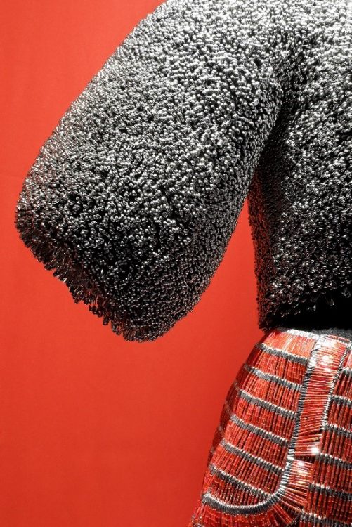
Each exhibition varied and had intricate meaning, however, a monumental design for me was Tonje Hlvorson’s Obsession. 7,000 hours later and 500,000 safety pins collected, I stood in front of an amazing statement two piece. A metallic silver ballooned sleeve top which sat so perfectly on the manikin I could not help but wonder how great it would look on me. Each safety pin on the shorts beaded to hot red perfection with a silver outline completing the ensemble.
After a short interview with Tonje, I discovered that the final product was solely about fashion but the obsessive process, the architecture and mathematics involved in putting it together. Despite the throbbing of her hands, Tonje kept going. Young Swedish Design is a must see not only for the aesthetics but for the poignant story behind each design.
We were later graced with a beautiful luncheon and informative talk at the interior design company Svenskt Tenn. The table lay set with the bright archaic flower-patterned table cloth – a Josef Frank original. Complimenting this was the chrome silver embellished plate and cutlery topped with a simple white china dish and, of course, a complementary glass of Chardonnay – the welcome was already warm. It was interesting to know and experience boldness and simplicity at the same time.
With such a profound effect in homes globally with their iconic furniture statement pieces like the striking patterned pillows and the stunning glass lamp collection, freshly crafted glass from Murano designed by Luca Nichetto. Svenskt Tenn is now a foundation promoting ecology and funding education in agriculture whilst working to preserve the Swedish tradition. Delving into the history of great Interior design while enjoying afternoon lunch, what more could you ask for?
Stockholm Light and Furniture Fair! Seated in the press hall we were greeted with a wealth of architects, designers and creatives. Here are a two short accounts of installations that I enjoyed – though there were many to choose from I have whittled it down to two – so you can experience these master pieces yourself:
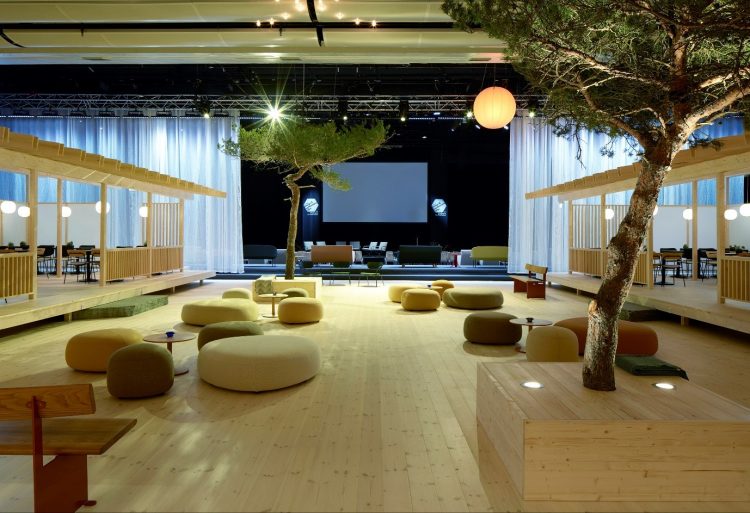
Anderssen & Voll, Design Bar – the design bar was located in the press hall. It was an open plan bar constructed with maple wood panelling. It was scarcely but intricately designed, with pots of greenery flattering each table. The lights hung delicately from the ceiling and the black slim line tables contrasted perfectly with the light wood. Anderssen & Voll wanted to create peace in the midst of chaos – I believed they achieved this with a bright but finely and intricately designed interior.
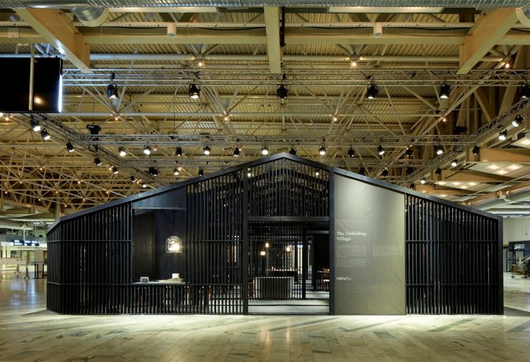
Neri & Hu, The Unfolding Village – This installation was a cultural representation from China. It depicted the notion of communication and the blurred lines between private and public conversation alongside the idea of gossip in the rural areas.
The design conveyed this message beautifully through a dark grey barred structure which made the installation almost look secretive but once inside you were met with open space and bright statement colour furnishings. The contrast in the installation’s design depicted the perfect idea of private and public communication.
There is a lot more that meets the eye with design and Stockholm. To experience the city through design was truly amazing and it also gave me a new perspective on sustainability. For fun, education, remarkable sights and robust meals – visit Stockholm!


