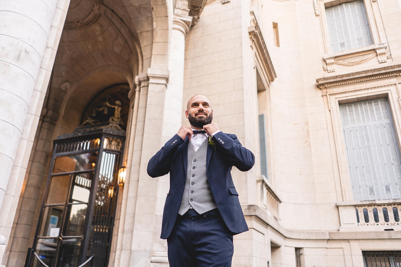
Morning preparation may take place beside a window, the ceremony under warm indoor bulbs and group photographs outside beneath cloud. The reception then introduces coloured decorative lighting, candles and phone cameras. A suit colour that looks perfect in a showroom can behave differently across these conditions.
This does not mean grooms need technical knowledge of photography. They need to test colour beyond one mirror and avoid relying on an edited product image or a single fabric name. Navy, blue, grey and green each cover a wide range of tones, and the surrounding shirt, flowers and venue walls affect how the eye reads them.
Testing Wedding Suits for Men Before the Final Decision
When browsing wedding suits for men, use TruClothing’s range to compare plain colours, checks and textured fabrics, then review the specific product details. Online images help create a shortlist, but screens differ in brightness and colour. The delivered suit should be examined in daylight and typical indoor light while the returns period and labels remain intact.
Wear the planned shirt during the test. White can make a suit colour appear deeper, while cream produces a warmer relationship. Take phone photographs without a filter from the front, side and back. Include one wider image, since a close portrait and full group photograph reveal different aspects of the cloth.
Texture Can Hold Detail When Colour Becomes Dark
Very dark navy and charcoal may appear nearly black in a dim room. Herringbone, tweed and a measured check can preserve some surface detail, especially in closer photographs. The texture should still suit the venue and season. A heavy rural cloth is not automatically right for a warm city ceremony simply because it photographs well.
Shiny fabrics reflect direct flash and may create bright areas. Matte cloth usually behaves more quietly, while velvet absorbs and reflects light in a distinctive way suited to certain evening looks. Ask the photographer about planned flash use if the suit includes strong velvet or satin elements.
Venue colours can alter the outfit
Red brick, dark timber and warm hotel lighting can make brown and burgundy tones feel richer. Pale stone, white walls and open gardens provide a cooler setting where blue and grey read clearly. None of these combinations is compulsory, but viewing venue photographs helps identify possible clashes.
Do not attempt an exact colour match with curtains, flowers or bridesmaid dresses. The groom is a person, not part of the decoration. Select a suit colour that relates to the setting, then use a tie, pocket square or boutonniere for a smaller connection to the wedding palette.
Phone cameras favour clear relationships
Professional photographers can control exposure and edit a final gallery. Guest photographs usually come straight from phones with automatic processing. Strong backlighting can turn a dark suit into a flat silhouette, while mixed indoor light can change subtle colour differences. Clear contrast between shirt, tie and suit helps the outfit remain readable.
A plain white or pale blue shirt is a reliable base. If the suit has a visible check, choose a tie from one of its quieter colours rather than adding another competing pattern. Ask a friend to take test photographs at the likely ceremony time if access to the venue is possible.
Groomsmen need consistency, not impossible colour precision
If the wedding party orders the same suit style, record the exact product name and colour. Generic instructions such as medium blue or dark grey produce variation across retailers. Order early enough for everyone to try the complete outfit and resolve sizing while stock remains available.
Different batches of cloth can occasionally vary slightly, and separately purchased accessories described by the same colour name may not match. Exact sameness is less important for ties and pocket squares when the difference is clearly deliberate. For the main tailoring, keeping the group to the same confirmed product gives photographs a more coherent base.
Skin tone rules should remain flexible
Online advice often assigns rigid colours to broad skin-tone categories. These rules can be reductive and ignore the shirt, tie, lighting and wearer’s preference. A better test uses the actual suit beside the face in natural light. Look for a colour that does not drain the complexion or overwhelm it, then review photographs rather than relying only on the mirror.
Personal comfort matters because uncertainty shows in posture and expression. A fashionable green suit offers little benefit if the groom spends the day wondering whether it feels like him. Navy and grey are not dull when the fit, cloth and accessories have been chosen carefully.
Evening lighting needs restraint
Coloured uplighters and dance-floor lighting can make bright suits change dramatically. A deep blue may appear purple, while green can shift under magenta light. This is part of the atmosphere and cannot be controlled in every guest image. Neutral shirts and restrained accessories stop the full outfit becoming visually chaotic.
If the reception has a strong lighting scheme, ask the venue for recent unedited photographs. These provide more useful evidence than a promotional image. The groom does not need a different suit for the evening but knowing how the room behaves can inform the tie and pocket square.
Complete the test with movement
Colour is only one part of a successful photograph. Fasten the jacket, sit down, walk and turn while someone records a short video. Check that the vents remain closed when standing, the collar meets the shirt, and the waistcoat covers the waistband. A beautiful colour cannot compensate for visible pulling or an uneven hem.
Once the choice is made, keep the full outfit together and photograph the approved combination. Share the reference with anyone responsible for packing or dressing-room support. Mixed lighting will always produce variation, but careful testing gives the suit a stable identity across the ceremony, portraits and informal images that tell the wider story of the day.